Article Text

Statistics from Altmetric.com
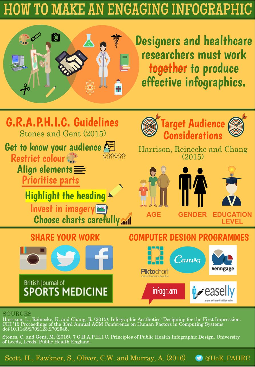
Visual data are all around us. A clear purpose of information graphics (infographics) is to communicate key messages in an engaging fashion.1 They are increasingly being used to complement and add value to scientific papers. Some infographics are completely ignored or not given a second glance, while others draw people in and efficiently convey a message to the engaged reader.2 While people are able to form an opinion of infographic content in a split second, the process of successful infographic design can be much more time-consuming. Knowledge, good ingredients and an oven are helpful in making a delicious cake to suit consumer taste. There is an increasing appetite for infographics. We describe some theory and key ingredients, and discuss infographic computer programs that can help you produce outstanding infographics, and consider how to help effectively share infographics (figure 1).
The theory
Sufficient knowledge of the topic area is as important as artistic skill. Thus, as health professionals and scientists we can be encouraged to be hands-on in the infographic design process and should seek to custom-design infographics that are attractive and suitable for our target audiences.
Public Health England has published guidelines to be considered when designing infographics that contain public health messages.3
The seven GRAPHIC guidelines are as follows:
G: Get to Know Your Audience
R: Restrict Colour
A: Align Elements
P: Prioritise Parts
H: Highlight the Heading
I: Invest in Imagery
C: Choose Charts Carefully
In addition to the GRAPHIC principles, Gestalt laws help design infographics in a format that appeals to the cognitive processes of the human brain and to catch the attention of people's eyes.4 A knowledge of these principles will inform design options and infographic outputs, but the actual process of infographic design and the number of steps involved will vary between different designers. Infographics are unique; so are the designers; so are the readers.
Key ingredients for success
Factors such as age, gender and education level of the consumer have been found to influence the ability of an infographic to capture attention.5 Produce a final design which does appeal to the target population, and may additionally engage a wider audience.5
Seek advice from the population group the infographic is designed for.3 Asking for opinions on visual data designs from individuals outside of the workplace or design team is also crucial to ensure that infographic content and terminology is understandable to those outside of the healthcare profession.
Strike a balance between visualisations, images and text.6 For example, an infographic is a tool that can be used to synthesise information and data written in a journal article. It is a good idea to filter and sort the data to ensure that the most relevant information is included in the infographic design. An example of accomplishing this would be compiling a list of important statistics or sketching a mock-up of the infographic layout before beginning the design process.
Text should be used sparingly in an infographic and should provide clarity and understanding of the concepts that are presented visually. There are a number of ways to present text in infographics—brief annotations, checklists, summaries and fundamentally concise and striking titles.7
Apply the ‘no text test’. Ask yourself is the infographic comprehensible when the text is removed.6 They need to catch the eye, and then draw the reader into the narrative.
Use no more than three different font types6 and use a colour palette of 3–5 colours that complement one another.3
Infographic computer programs
A number of commercial software packages/programs are available (Piktochart, Canva, Venngage, Easel.ly, Infogr.am, Visualize, Creately, Visme, Google Charts) to generate infographics that require skills similar to those needed for generating a PowerPoint presentation. These programs optimise the infographic for social media presentation and often provide general guidance, as well as specific guidance regarding image size, colour palette, etc.7 Many infographic designer software programs will provide templates of each of the different infographic formats that can be used as inspiration for presenting your data visually.
Key theory and ingredients for designing and sharing engaging infographics.
Sharing your infographic
It is worth considering how your infographic can be shared to a target audience. This may be via Twitter, Facebook and other social media, in a peer-reviewed journal (BJSM encourages standalone infographic submissions, and infographics embedded within papers to distil key concepts), while it could be printed as a poster or used at a bus stop. Your ‘share strategy’ will likely inform the design process.3 ,8
Summary
Our experiences are that it is essential to be confident in the research topic, theory or concept that is being discussed, but creating and sharing infographics can be rewarding. Have patience with the design process, ask for feedback and opinions of others, and have fun when creating exciting and effective infographics!
Footnotes
Twitter Follow Hilary Scott @thehilsarealive, Christopher Oliver @CyclingSurgeon and Andrew Murray @docandrewmurray
Competing interests None declared.
Provenance and peer review Not commissioned; externally peer reviewed.